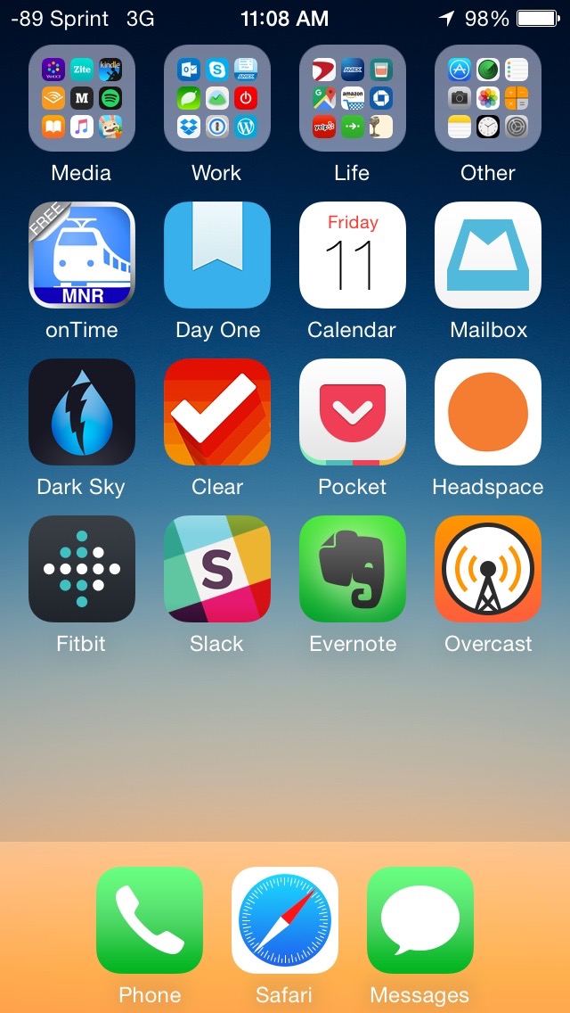
For the past two weeks I’ve been using a single iPhone home screen configuration a la CGP Grey.
Most of the apps live in folders on the top row, divided into four main buckets: Media, Work, Life, and Other. The other three rows of apps are the ones I use most frequently and want quick access to.
The rest? I search for them. This is just as convenient for me as swiping through multiple screens, but the added benefit is that my screen is much less cluttered.
In the process of reorganization, which I completed during a 30 minute train ride, I took a moment to delete applications I no longer use, enable me to waste too much time, or provide too little value. For the distracting/time wasting apps I still want to use (Instagram, Twitter), I made the intentional decision to move them into folders so I am less likely to use mindlessly tap them when I have a free moment. I filled their would-be spots on my home screen with apps I want to use more: Day One to journal and Pocket to read some of my recently saved articles.

The Results
- My screen is less cluttered, so it is easier to look at.
- I’m spending less time mindlessly tapping on an application and scrolling through stuff I didn’t really look at anyway.
- I’m spending more time using my phone for productive purposes like journaling and reading articles I’ve saved.
- My default method of finding an application is now using the search functionality (swiping down and typing) instead of swiping through screens, which is very useful when using a different iOS device.
I really like this layout and I think it will prove to be my long-term configuration.

