Aren’t familiar with Sol LeWitt or his art? Read this.
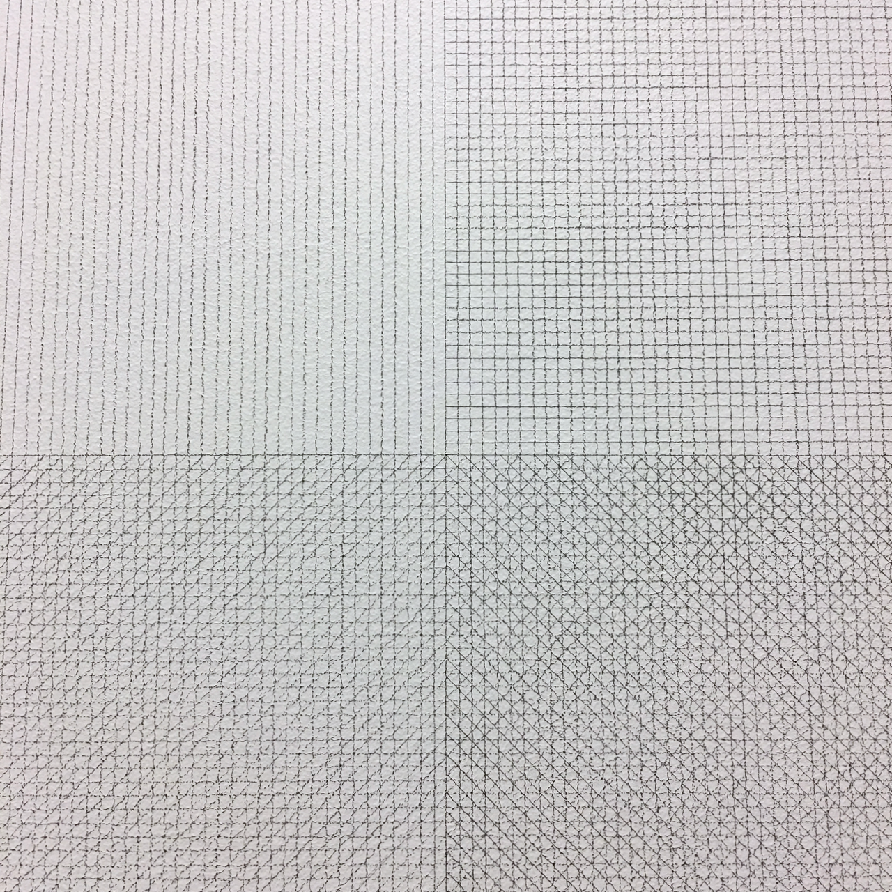
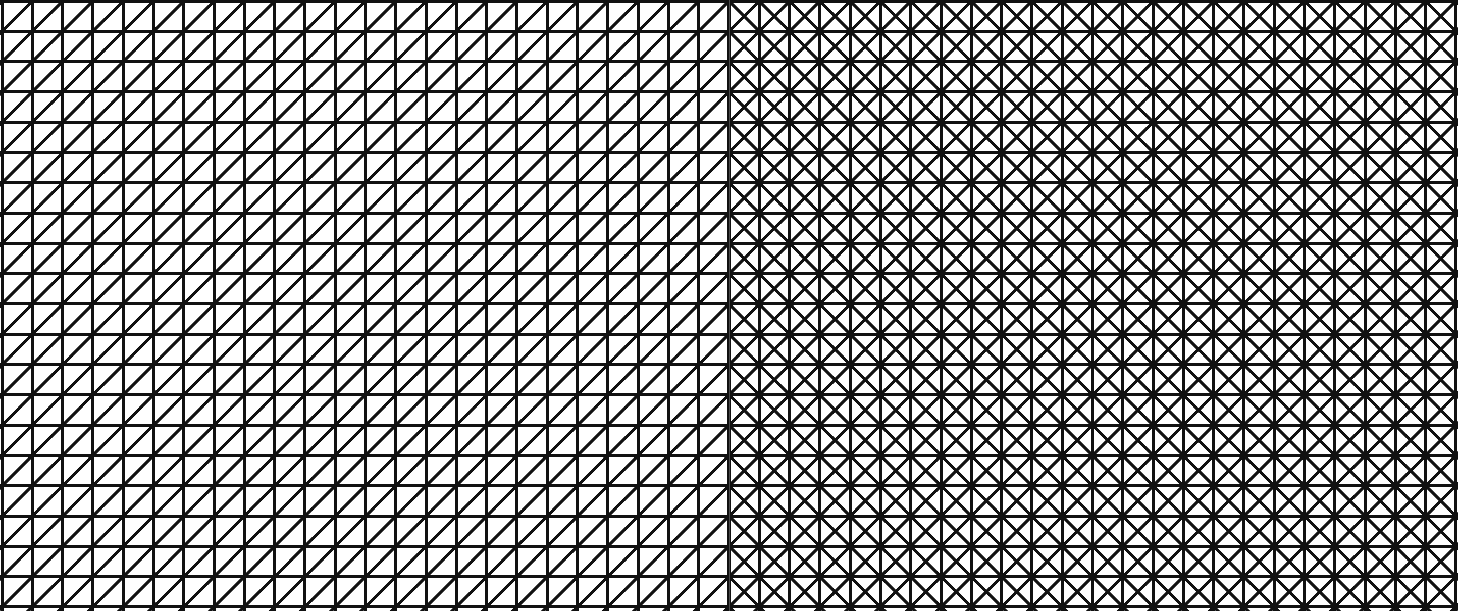
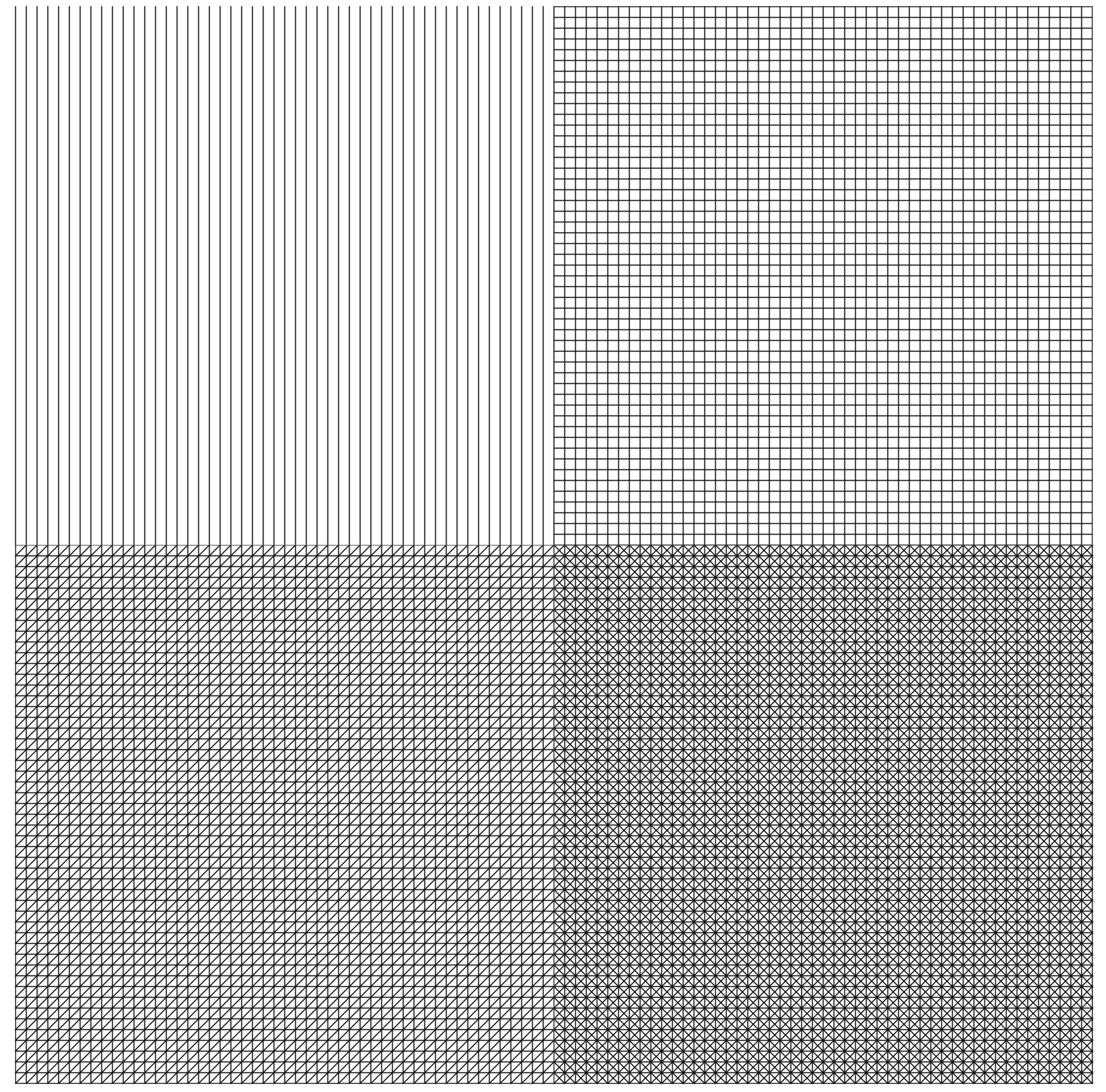
Wall Drawing 56: A square is divided horizontally and vertically into four equal parts, each with lines in four directions superimposed progressively.
Wall Drawing 56 was the first of Sol LeWitt’s wall drawings I tried to implement here on the web. I picked it for its simplicity: A square with four sets of patterns and two colors. I wasn’t sure exactly what interpreting and implementing these would entail, so I wanted something simple and recognizable at first.
Open my D3 implementation of Wall Drawing 56 in a new window →
Design Decisions
- While any interpretation of Sol LeWitt’s instructions is technically valid as long as each statement is accounted for, I feel a responsibility to make my implementation beautiful, clean, and symmetrical.
- There are other valid layouts of this piece (the patterns could be in a different order depending on where you chose to start), but I decided to implement the popularly known configuration currently on display at MASSMoCA. I will stray from this path later on in the project.
- On a wall, the dimensions are dictated by the physical size of the wall itself. On the web, since windows change size so easily and the proportions of the art are constant, I chose to define a fixed size for this piece.
Tools Used
-
D3.js - The D3.js library is well-suited to Sol LeWitt’s early works. D3’s foundational principle of joining data to elements is easy to apply to LeWitt’s symmetrical objects.
-
Textures.js - I’m using this library to quickly create the background patterns. It plays very well with D3.js, which is why I chose it. It is a great little library that is very easy to use. It has some limitations around the edges, but the alternative is writing my own SVG paths for the patterns, which I didn’t want to do at this time.
Technical Details
- I repurposed some of the data-generating code for the squares from my Let’s Make a Grid with D3.js post.
- I had to do a lot of trial-and-error on the width, height, starting points for each quadrant, and pattern size to make sure the patterns turned out clean and symmetrical. If you dig into the javscript, you’ll see odd variable definitions.
- This is one SVG with two groups (one for each row) and two
rectelements in each group (one for each quadrant). - The lines/patterns are singular path fills in each square. There is only one pattern per quadrant here because this piece is in black and white.
- Want to dig in a little further? Check out my implementation and view source. All of the D3 specs are there.
What I learned
- In this first implementation I was getting my feet wet with Textures.js. I got a solid understanding of how to define and create patterns with it.
- When my first cut was pretty rough around the edges (literally, because the patterns had odd spacing), I noticed how precise and clean the other versions I’ve seen are. I now pay special attention to the fine details when evaluating these pieces.
Inspiration and References
- Wall Drawing 56 at MASSMoCA
- Pages 140-141 in Sol LeWitt: 100 Views
Detail shot of the version on display at MASSMoCA:

Wide shot of the version on display at MASSMoCA:


