Aren’t familiar with Sol LeWitt or his art? Read this.
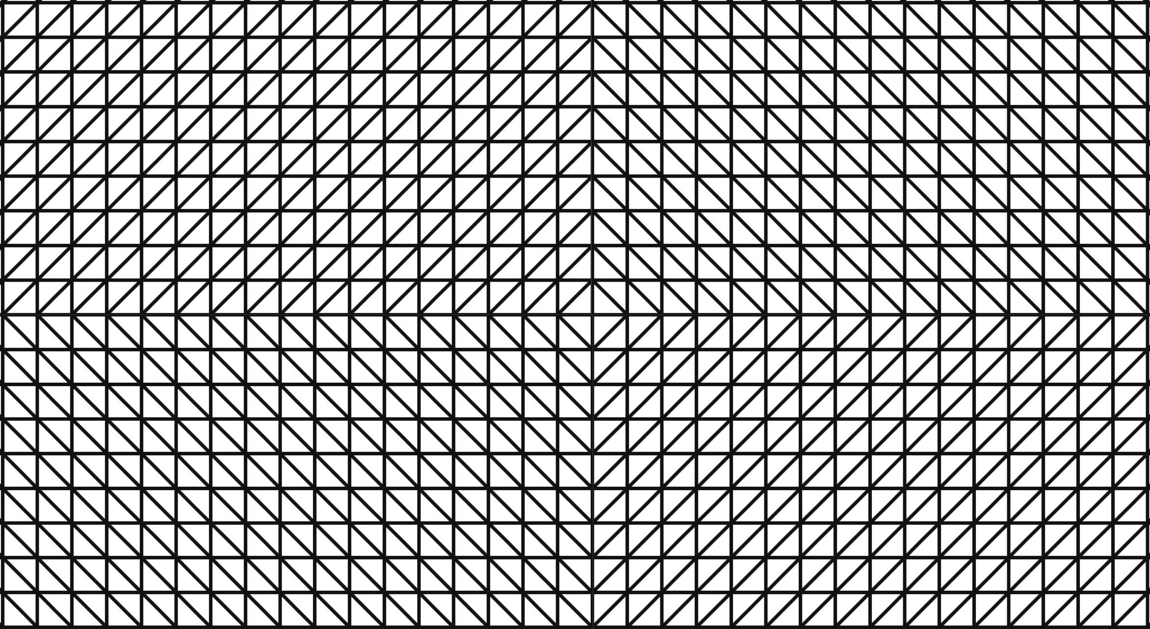
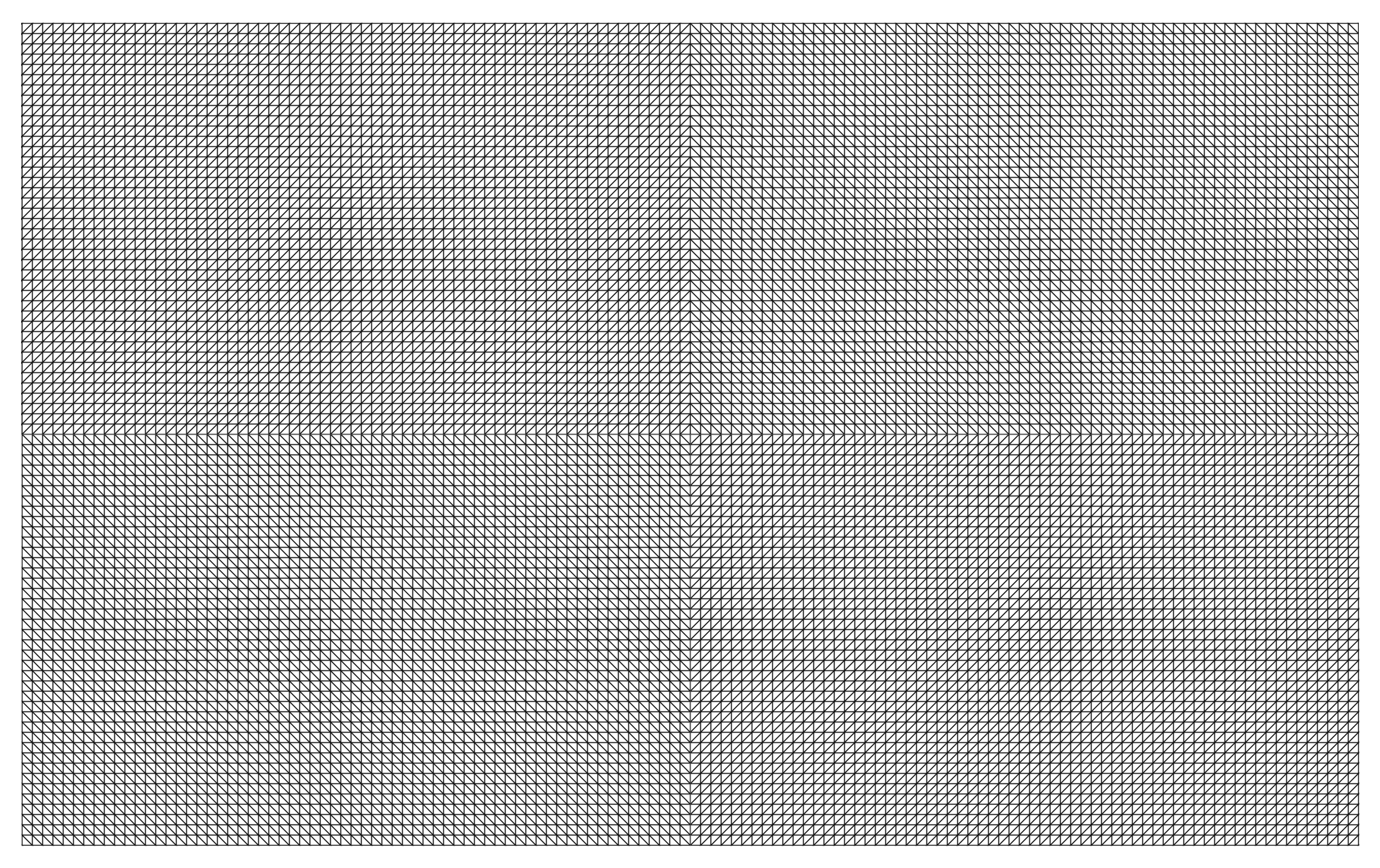
Wall Drawing 11: A wall divided horizontally and vertically into four equal parts. Within each part, three of the four kinds of lines are superimposed.
Wall Drawing 11 is remarkably close to Wall Drawing 56, which is the first one I implemented. I discovered that with only a few changes (width, height, and pattern direction) I could turn my code for 56 into 11.
Open my D3 implementation of Wall Drawing 11 in a new window →
Design Decisions
- While any interpretation of Sol LeWitt’s instructions is technically valid as long as each statement is accounted for, I feel a responsibility to make my implementation beautiful, clean, and symmetrical.
- There are other valid layouts of this piece (the patterns could be in different directions as long as you use three), but I decided to implement the popularly known configuration currently on display at MASSMoCA. I will stray from this path later on in the project.
- I reused most of the foundation I laid with Wall Drawing 56. I chose to change the dimensions to a rectangle to better fill the page and to differentiate it. A rectangle also stays closer to the version of 11 at MASSMoCA than a square.
Tools Used
-
D3.js - The D3.js library is well-suited to Sol LeWitt’s early works. D3’s foundational principle of joining data to elements is easy to apply to LeWitt’s symmetrical objects.
-
Textures.js - I’m using this library to quickly create the background patterns. It plays very well with D3.js, which is why I chose it. It is a great little library that is very easy to use. It has some limitations around the edges, but the alternative is writing my own SVG paths for the patterns, which I didn’t want to do at this time.
Technical Details
- I reused most of the foundation I laid with Wall Drawing 56.
- I changed the width, height, and starting point of each quadrant to make a rectangle instead of a square.
- Want to dig in a little further? Check out my implementation and view source. All of the D3 specs are there.
What I learned
- I really got the hang of setting up patterns in multiple directions here and configuring them such that they line up to create a design where the edges meet.
- Dimensions matter. I started out with this as a square, but I think it fits normal browser windows much better as a rectangle.
- Reuse bits of code if you can!
Inspiration and References
- Wall Drawing 11 at MASSMoCA
- Pages 130-131 in Sol LeWitt: 100 Views
Detail shot of the version on display at MASSMoCA:

Wide shot of the version on display at MASSMoCA:


