Aren’t familiar with Sol LeWitt or his art? Read this.
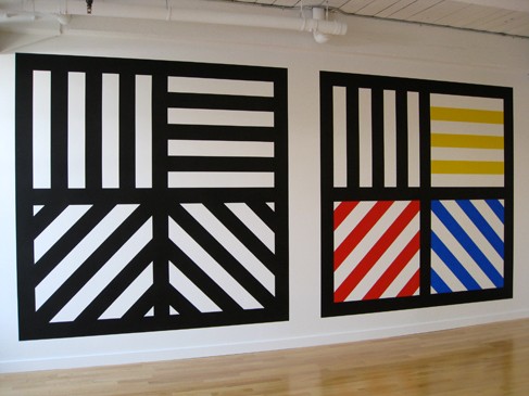
Wall Drawing 391: Two-part drawing. The two walls are each divided horizontally and vertically into four equal parts. First wall: 12-inch (30 cm) bands of lines in four directions, one direction in each part, drawn in black India ink. Second wall: Same, but with four colors drawn in India ink and color ink washes.
391 is one of the iconic images that people instantly recognize as a Sol LeWitt. After making the simple line drawings, I wanted to try something more comfortable and a little more complex. Now that I’ve created this, I could translate it into #419. Perhaps I will do this in the future.
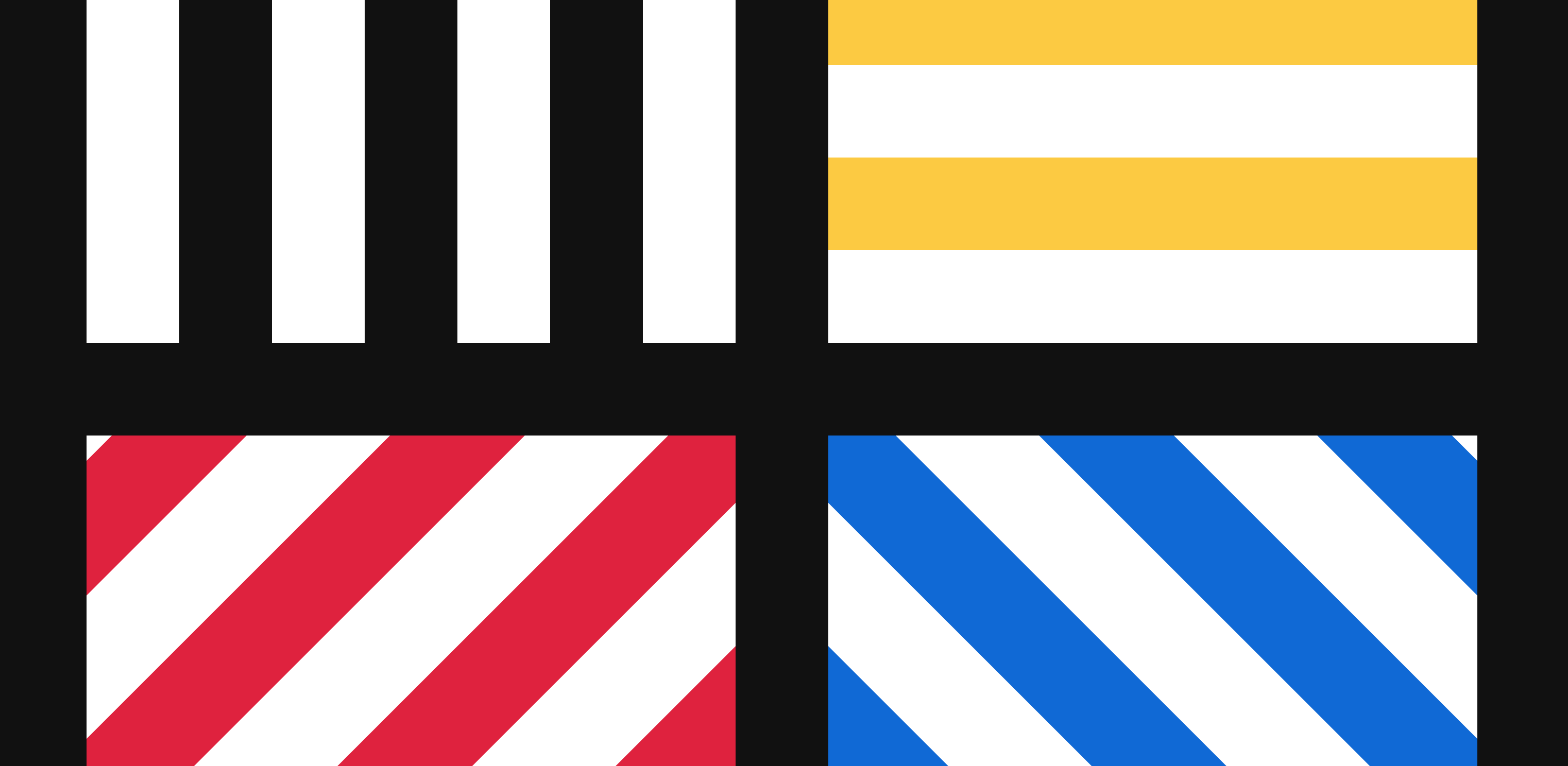
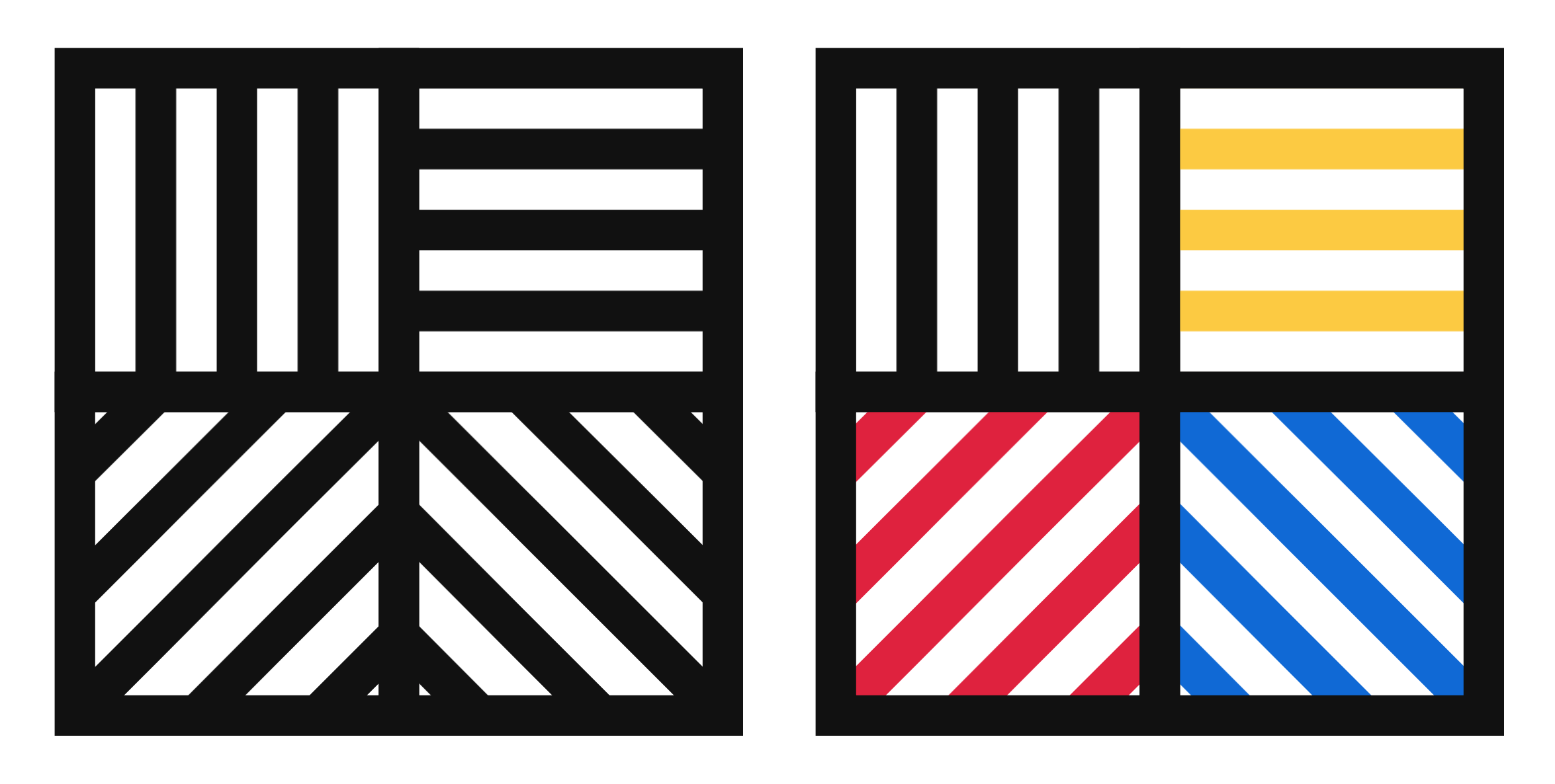
Here is an image preview. Click on it to see the D3.js version:
Open my D3 implementation of Wall Drawing 391 in a new window →
Design Decisions
- While any interpretation of Sol LeWitt’s instructions is technically valid as long as each statement is accounted for, I feel a responsibility to make my implementation beautiful, clean, and symmetrical.
- Besides for this being a commonly recognized piece where it would be noticeable that I deviated from the norm, when I made this I was still unsure of myself. I wanted to see if I could translate what I saw in person to D3.js as closely as possible. I think it turned out pretty well.
- When Sol LeWitt says “four colors”, the regular interpretation is black/dark gray, yellow, red, orange. When he says “four directions”, the common interpretation is 0 degrees, 90 degrees, 45 degrees, and 135 degrees.
- Sol LeWitt dictated a 12-inch bands. Since inches are fuzzy on the web and regular screens aren’t as wide as walls, I scaled things down and translated it into pixels. I kept with the spirit and chose a multiple of 12: 36 pixel bands.
- On a wall, the dimensions are dictated by the physical size of the wall itself. On the web, since windows change size so easily and the proportions of the art are constant, I chose to define a fixed size for this piece.
Color Palette
Onyx
- cmyk:
- 78 72 66 74 1.00
- rgba:
- 17 17 17 1.00
- hex:
- #111111
Sunglow
- cmyk:
- 1 14 75 1 1.00
- rgba:
- 252 202 66 1.00
- hex:
- #FCCA42
Alizarin Crimson
- cmyk:
- 1 87 61 1 1.00
- rgba:
- 223 34 62 1.00
- hex:
- #DF223E
Navy Blue
- cmyk:
- 71 41 0 0 1.00
- rgba:
- 16 105 213 1.00
- hex:
- #1069D5
Tools Used
- D3.js - The D3.js library is well-suited to Sol LeWitt’s early works. D3’s foundational principle of joining data to elements is easy to apply to LeWitt’s symmetrical objects.
- Textures.js - I’m using this library to quickly create the background patterns. It plays very well with D3.js, which is why I chose it. It is a great little library that is very easy to use. It has some limitations around the edges, but the alternative is writing my own SVG paths for the patterns, which I didn’t want to do at this time.
Technical Details
- I repurposed some of the data-generating code for the squares from my Let’s Make a Grid with D3.js post.
- This is two SVGs with two groups each (one for each row) and two
rectelements in each group (one for each quadrant). The only difference between the left and right SVG squares is the color. - The stripes are singular path fills in each square. There is only one pattern per quadrant here because this piece has simple, non-overlapping colors.
- Want to dig in a little further? Check out my implementation and view source. All of the D3 specs are there.
What I learned
- There are tradeoffs to using libraries to generate patters for you. At the width of the squares I’ve specified here, the size of the pattern should be
sqrt(2)times the size of the vertical one. When I run those calculations and set the diagonal patterns as such, the right one lines up but the left one is shifted too far up. I ended up finding a middle ground, but the stroke size of the bottom ones aren’t exactly 36 pixels wide. They are 37 pixels wide. That is the price I pay for using a library. I’ll learn to write my own SVG patterns in the future. - Many interpretations of Sol LeWitt’s directions (including ones he oversaw the installation of) are very geometric and symmetrical.
Inspiration and References
- Wall Drawing 391 at MASSMoCA
- Page 164 in Sol LeWitt: 100 Views
Wide shot of the version on display at MASSMoCA:


