Aren’t familiar with Sol LeWitt or his art? Read this.
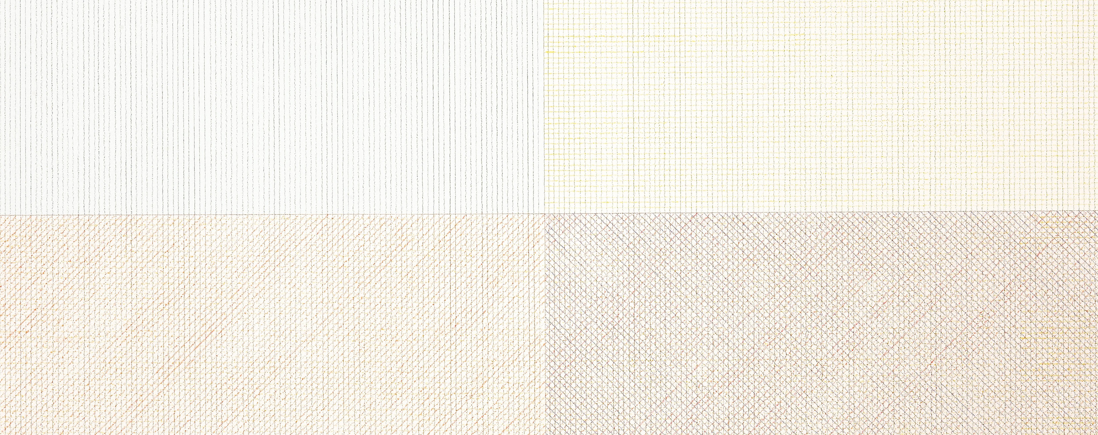
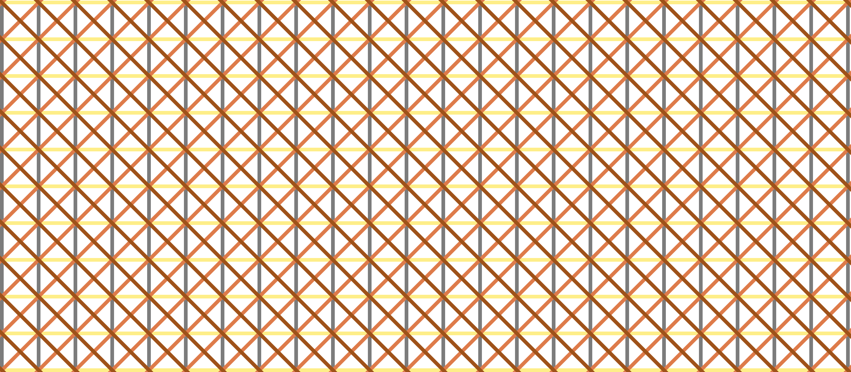
Wall Drawing 87: A square divided horizontally and vertically into four equal parts, each with lines and colors in four directions superimposed progressively.
Since this is so close to 56 (which I’ve already done), I wanted to add an additional element to challenge myself and learn something: Transitions. The difference between the two is the separate color for each line direction, which ended up lending itself to transitions nicely.
Adding the color and transitions into this one made me change my mental model for how I’m building these implementations. I was able to complete the first three I picked (56, 11, and 391) with only four <rect> elements inside the SVG: One for each quadrant. This is because I was able to make a single pattern for each quadrant (even though it appears that there are four sets lines are going in different directions) and have the patterns match up with the other quadrants. Textures.js doesn’t support making line-based patterns with more than one line color, so I needed to find a different approach.
The solution turned out to solve my mental block for both the colors and the transitions. I started to doodle this drawing in a journal and realized that I did each line direction one whole layer at a time, layering each one on top of the others. Yet, I had been trying to cram all four directions into a single layer here on the web. So, I modified my D3 code to join more <rect> elements with different classes to the same underlying grid array to simulate the effect of layering the different colors.
Then, I added a transition() and a delay() to each “layer” so that the viewer can also experience and take notice of the intentional layering of this piece.
There is definitely more I can do with transitions. This is just the beginning for me. I achieved what I wanted with this piece, so I’m going to move on to others and continue exploring and learning how to implement transitions.
Here is an image preview. Click on it to see the D3.js version:
Open my D3 implementation of Wall Drawing 87 in a new window →
It is also available as a block.
Design Details
- While any interpretation of Sol LeWitt’s instructions is technically valid as long as each statement is accounted for, I feel a responsibility to make my implementation beautiful, clean, and symmetrical.
- When he says “four directions”, the common interpretation is 0 degrees, 90 degrees, 45 degrees, and 135 degrees.
- On a wall, the dimensions are dictated by the physical size of the wall itself. On the web, since windows change size so easily and the proportions of the art are constant, I chose to define a fixed size for this piece.
Color Palette
Unlike the earlier colored versions that used grey, yellow, red, and blue, this uses Sol Lewitt’s second color palette of choice: grey, yellow, tan, and reddish-brown.
Concord
- cmyk:
- 44 36 33 1 1.00
- rgba:
- 124 124 124 1.00
- hex:
- #7C7C7C
Sweet Corn
- cmyk:
- 3 4 45 0 1.00
- rgba:
- 254 238 136 1.00
- hex:
- #FEEE88
Jaffa
- cmyk:
- 2 48 67 1 1.00
- rgba:
- 222 123 74 1.00
- hex:
- #DE7B4A
Hawaiian Tan
- cmyk:
- 7 56 96 19 1.00
- rgba:
- 159 82 25 1.00
- hex:
- #9F5219
Tools Used
- D3.js - The D3.js library is well-suited to Sol LeWitt’s early works. D3’s foundational principle of joining data to elements is easy to apply to LeWitt’s symmetrical objects.
- Textures.js - I’m using this library to quickly create the background patterns. It plays very well with D3.js, which is why I chose it. It is a great little library that is very easy to use. It has some limitations around the edges, but the alternative is writing my own SVG paths for the patterns, which I didn’t want to do at this time.
Technical Details
- I repurposed some of the data-generating code for the squares from my Let’s Make a Grid with D3.js post.
- One
svgelement with two groups and 8rectelements in each group. - Basic
transition()anddelay()functions applied to animate the layers. - Want to dig in a little further? Check out my implementation and view source. All of the D3 specs are there.
Inspiration and References
- Wall Drawing 87 at MASSMoCA
- Pages 144-145 in Sol LeWitt: 100 Views
Detail shot of the version on display at MASSMoCA:

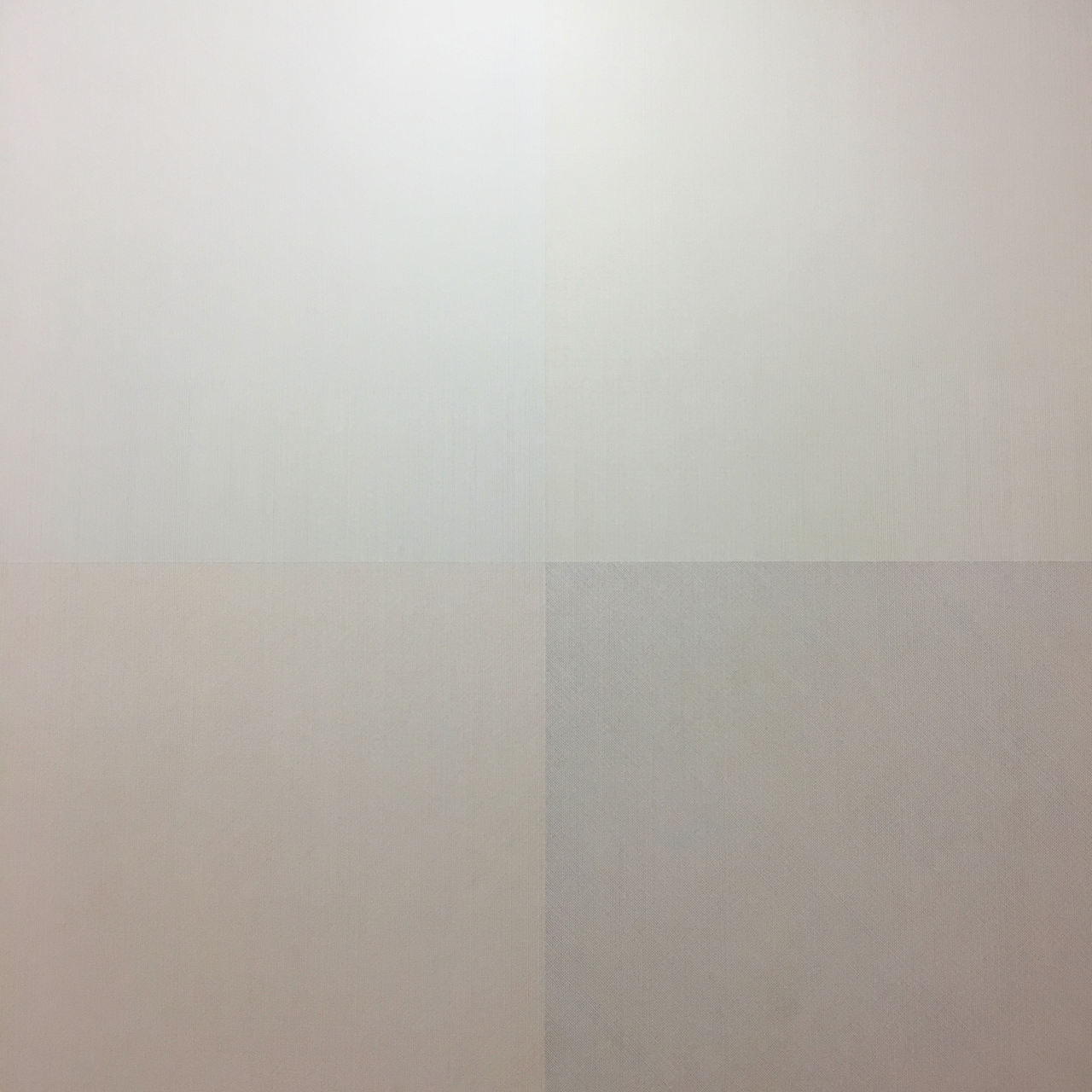
Wide shot of the version on display at MASSMoCA (Poor lighting):


