Word clouds
Data scientists notoriously hate word clouds. Besides for figuring out what the top 2-3 words are (because they are the biggest), it is difficult to see how much one word is used relative to another. Unfortunately, clients and non-data people love word clouds and sometimes insist on them. What is a self-respecting data nerd to do?
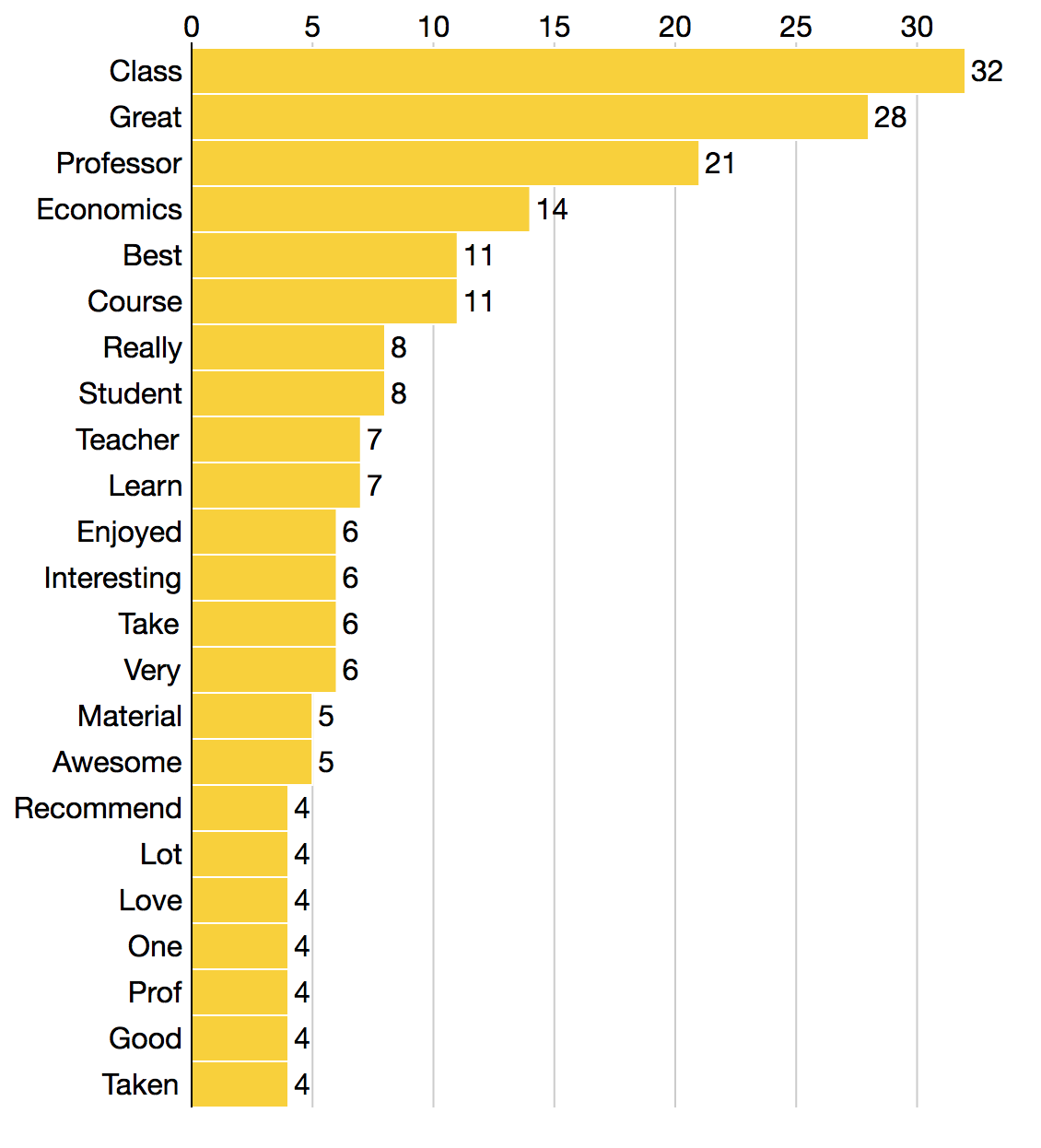
Pair it a word frequency chart!
The easiest way to do this is by using Python’s counter:
Counter(words).most_common()Then you can use your favorite charting tool to make a bar chart of the results. I prefer D3.js.
Results


If you see both together, you get a better understanding of the words being used. Of course, a single word doesn’t always capture sentiment. They can be helpful in smaller data sets, but sometimes common phrases are more helpful in larger data sets. For common phrases, use n-gram analysis.
For more on visualizing text, check out episode 62 of the Data Stories podcast and the Text Visualization Browser.


